Kitchens are where life happens. You see it in the first crayon masterpieces taped to the fridge. The report card handed over while the kettle whistles. The engagement ring slipped onto a counter while dough rises. It is not hard to see why a functional, beautiful kitchen drives home value. It is the heart of the house.
But a pretty room is useless if it fights you when you try to cook.
Layout is everything. You need flow. You need space. When friends come over, you do not want them tripping over your ankles. You need clear traffic routes. You need a zone for the cook that stays undisturbed.
Think about who lives in your house. How many people cook at once? Experts say you need 48 to 54 inches of clearance for one person to walk behind another safely. If you have young kids, the rules change. If someone uses a wheelchair, the rules change again. Measure twice. Cut once.
There are four main shapes to choose from. Pick the one that fits your square footage and your habits.
Зміст
The Four Basic Kitchen Layouts
The Galley
Two parallel walls. Appliances on both sides. It is efficient. Tight, but efficient. Great for small spaces or single cooks.
The L-Shape
Three main elements—the sink, stove, and fridge—sit on two perpendicular walls. This creates a natural work triangle. It opens up the room. It allows for a second person to enter without blocking the cook.
The U-Shape
Three walls are utilized. This offers maximum counter space and storage. It is cozy. It keeps the cook close to everything.
The G-Shape
This is a U-shape with a fourth wall. Often a peninsula. It adds cabinetry. It adds counter space. It adds appliances. It is for big kitchens or big appetites.
For efficiency, look at the work triangle. It connects your sink, stove, and fridge. Keep the sides between 4 and 9 feet. Total perimeter between 13 and 26 feet. This reduces steps. It reduces fatigue.
Another modern strategy? Two work areas. One for cooking. One for serving and clearing. Each with its own sink. It stops traffic jams during dinner prep.
Choosing Your Decorative Style
Once the bones are set, you fill them with style. Your kitchen should reflect your taste. Here are some approaches to consider.
Cultivating a Vintage Look
Older homes deserve respect. You can keep the soul of a classic house while upgrading the function. Look for cabinetry with vintage flair. Appliances with retro curves. Wall coverings that mimic old tiles or wallpaper. You can create a custom vintage feeling. It does not mean sacrificing modern efficiency. It means blending eras.
Using Bold Colors
Colors make statements. But they can also make mistakes if used carelessly. Choose bold hues wisely. Use them to highlight. Use them to zone. A bold backsplash. A painted island. Keep the rest neutral to let the color pop. Too much color feels chaotic. Too little feels sterile.
Integrating Wood in Kitchen Decor
Wood adds warmth. It adds texture. It makes a room feel bright and clean. Think of blonde woods for a Scandinavian look. Darker stains for a traditional feel. Wood is natural. It ages well. It feels good to touch.
Southwestern Styling
This style draws from the open kitchens of New Mexico. It uses bold colors. Terracotta. Turquoise. Deep reds. The result is warm. It feels inviting. It works well in sunny climates or homes with lots of natural light.
Comfortably Casual
This is about coziness. It welcomes guests. It feels like home. Think soft textures. Open shelving. A breakfast nook. It is not about being messy. It is about being lived-in. It is a key element for family homes.
Clean and Neat
Storage is king. But storage can look bulky. The challenge is ample storage with an open look. Streamline your design. Use vertical space. Hide clutter behind clean lines. Maximize storage without sacrificing airiness.
Stainless Steel Ideas
Stainless steel appliances are popular. But you can go further. Use stainless steel for backsplashes. For hardware. For light fixtures. It is cool. It is modern. It is easy to clean. It reflects light.
Restaurant Styling
Want sophistication? Look to upscale eateries. Clean lines. Minimal decor. High-end materials. It is elegant. It is functional. It makes cooking feel like a performance.
The Vintage Look in Detail
You do not need a full renovation to get a vintage vibe. Start with details. Apron-front sinks. Brass fixtures. Open shelving with vintage china. A farmhouse table. These elements add character. They ground the space in history.
Chef’s Kitchen
Organization is a dream for serious cooks. A chef’s kitchen has a place for everything. Storage for every appliance. Every tool. Every utensil. Drawers for knives. Pull-outs for pots. It keeps the counters clear. It keeps the workflow smooth.
Adding Color and Modern Touches
Modern kitchens stay clean by providing a niche for every element. Cabinet manufacturers offer hundreds of options. Clever interior fittings for silverware. Appliance garages for deep corners. Custom panels to hide the fridge.
Door styles matter. Cherry or mahogany with glass fronts? Traditional appeal. Blonde wood, laminate, metal, mesh inset panels? Contemporary. Oak or maple raised panel, painted or stained? Country charm.
Be ingenious with space. You need 12 inches of landing space on either side of any cooking surface. It is a safety feature. It is a prep zone. If you cannot fit an island, extend the counter. Add stools. Consider a built-in folding table. It extends when you need it. Drops down when you don’t.
Pullout work surfaces are great for chores. They maximize every inch.
Extend a row of cabinets into the breakfast area. It visually links the rooms. It gains storage. Repeat surfaces. Laminate on countertops matches the breakfast table. Echo tile or wallpaper colors in cushions and curtains. It creates cohesion.
Forgo upper cabinets to open up a cramped kitchen. Use open shelving instead. It feels lighter.
Glass-door cabinets bounce light around. They keep the room looking fresh. Install French doors to capture light from a dining room or porch. Knock down a wall to a rarely used room to create a pantry. It expands your space. It changes how you live.
What will you prioritize? Function first? Or style? The best kitchens have both. But you have to start somewhere. Usually, that somewhere is a floor plan and a blank wall.

White still dominates the market. You’ll see it in almost every suburban kitchen. But black and stainless steel are closing the gap fast. The choice isn’t just about style anymore. It’s about how the appliance fits into the room’s narrative.
Some homeowners hide their fridges. They panel them to match the cabinets. It’s a minimalist move. Clean lines. No visual noise. But others want their appliances to speak up. Take a commercial-grade stainless-steel refrigerator. In a sun-baked modern kitchen, it doesn’t just store food. It becomes a sculpture. A statement. The light hits the steel differently than it hits matte paint. It catches the eye first.
But what if you want less of the “new” and more of the “old”?
There are ways to inject nostalgia into a contemporary space without throwing out the modern amenities you rely on. It’s about texture. It’s about history. It’s about mixing eras so they don’t clash, but complement each other.
How to Get Vintage Kitchen Details Right
You don’t need a time machine. You need the right finishes. Start with hardware. Swapping sleek, flat-panel pulls for porcelain or brass knobs instantly shifts the vibe. It’s a small change. The impact is disproportionate.
Where to Find Authentic Vintage Elements
- Reclaimed Wood: Use it for open shelving or island accents. It brings warmth that stainless steel lacks.
- Matte Black Fixtures: Instead of shiny chrome, go for matte black faucets and light fixtures. They feel grounded. Historical.
- Patterned Flooring: Subway tiles are timeless. But consider encaustic cement tiles or checkerboard vinyl for a sharper, retro punch.
- Appliance Color: If you can’t afford a vintage 1950s fridge, look for modern models in pastel blue, mint green, or cherry red. They mimic the classic palette.
Which Materials Work Best for a Nostalgic Twist?
Glass-front cabinets are a great middle ground. They let you display dishware—maybe some mismatched vintage china or colored glassware. The contents become part of the decor. It feels lived-in. Authentic.
For countertops, consider butcher block or quarried stone. Stainless steel is cool to the touch. Wood is warm. Pairing a warm wood island with cool, modern appliances creates tension. That tension is where good design lives.
DIY Tips for a Vintage Kitchen Look
- Paint the Cabinets: Go for a soft, creamy white or a muted sage. Avoid high-gloss finishes. They read as too modern. Satin or eggshell holds up better and looks softer.
- Install a Faucet with a Pull-Down Sprayer: But choose one with a vintage shape. High-arc. Cross-handle. It bridges the gap between old aesthetics and modern function.
- Add a Window Pane: If you don’t have one, consider a faux window or a framed mirror above the sink. It adds depth. Light reflection. A sense of openness that older homes often had.
- Use Open Shelving: Replace upper cabinets with shelves. It forces you to curate. To display only what you love. It reduces visual clutter, making the space feel larger and more

Blending Antique Charm with Modern Utility in New Mexico
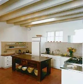
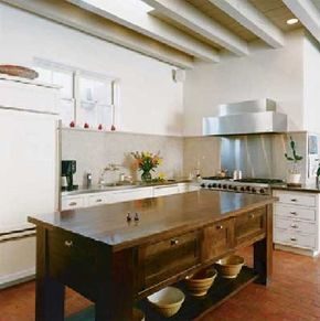
Old and new don’t just mix. They thrive together. This New Mexico kitchen proves you don’t have to choose between period charm and modern efficiency. You take the best of the past. Then you partner it with today’s amenities. The result? A kitchen that turns heads.
The design pulls no punches. White painted cabinets set a clean, bright stage. Stainless-steel countertops add durability and shine. A geometric range hood anchors the cooking zone, screaming 21st-century style. It’s sharp. It’s current.
But then there’s the island.
It defies the “too-new” label instantly. The piece looks like an antique farmhouse table. Not a replica. A genuine-looking workhorse. It grounds the space. It adds warmth that cold steel lacks.
“Charm isn’t just about age. It’s about texture and history in a high-tech space.”
The details continue the story. Bin pulls on the drawers. They’re low-key. Functional. They don’t shout for attention like brushed gold handles might.
Around the auxiliary sink, there’s a stretch of low-key wood. It contrasts with the metal. It provides a tactile break. Your hands rest there. The grain says something different than the smooth steel next to it.
This isn’t just decor. It’s a practical layering of materials. When you’re doing this yourself, watch the heights. Ensure the island table sits level with the main counters or stands distinct as a separate zone. The wood needs sealing. Stainless needs polishing. Keep the tools separate.
The mix works because of the contrast. Sharp lines against organic shapes. Cold metal against warm timber. It’s a balance that feels intentional, not accidental.
How do you source that farmhouse look without buying a ruin? Look for salvage yards. Check online marketplaces for solid wood pieces with good bones. Refinish the surface. Match the stain to the existing wood tones if you have them. If not, pick a color that pulls from the cabinet paint or the hood metal.
Safety matters here too. Wood near a sink needs maintenance. Water damage is the enemy of that antique aesthetic. Use a good sealant. Wipe up spills fast. The steel won’t mind. The wood will.
The neighborhood will notice. Not because it’s flashy. But because it feels lived-in and designed. It’s not a showroom. It’s a home.
And that’s the point.
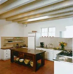
The brick flooring. The exposed beams. These are the bones of a traditional kitchen, but the vibe is anything but your grandmother’s ruffled curtains and crocheted pot holders. This space is modern. It is functional. Every appliance has a designated home. The chef has room to actually move.
It strikes a balance. Classic warmth meets contemporary efficiency. If you are stuck between old-world charm and sleek modernity, this setup will feel right at home.
But let’s talk color.
How to Use Bold Colors in Kitchen Without Overpowering the Space
Vibrant hues don’t just decorate. They wake you up. A splash of bold red or electric blue can energize the morning routine. But adding saturation to a room with heavy textures like brick requires strategy. You need to introduce color without creating visual chaos.
Start with the cabinetry. Paint one island a deep navy or a matte black. Let the rest of the units remain white or light gray. This grounds the bright colors. It keeps the space from feeling like a carnival.
Consider the backsplash. A subway tile in a bold hue adds texture and pattern without overwhelming the eye. It reflects light differently than flat paint. The brick floor absorbs it. The beams cast shadows. The color on the backsplash bounces it back.
Accessories are your safest bet for experimentation. Think canisters. Small appliances. A rug. Swap these out as trends change. You can’t easily repaint brick or replace structural beams, but you can swap out a toaster or a set of bowls.
Use the 60-30-10 rule as a guideline.
– 60% dominant color (usually neutral)
– 30% secondary color (cabinets, walls)
– 10% accent color (bold pops)
This prevents the vibrancy from becoming aggressive. It ensures the kitchen remains a functional workspace, not just a art installation.
The key is restraint. Let the architectural elements do the talking. Then, let the color provide the personality.
Adding Square Footage to the Equation
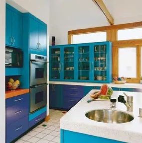
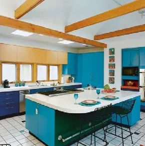
The first step in this transformation was structural. They added six feet to the kitchen’s footprint. That expansion did more than just add floor space. It gave the room room to breathe. The existing wooden beams overhead helped. They kept the vibe grounded. The space felt warm before the paint even went up. Now, it is welcoming in a different way. It grabs your attention. It wakes up the household every morning.
Picking Colors That Don’t Fade
This house sits in New Mexico. The renovation respected that modern Southwestern style. But the colors? They went loud.
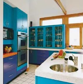
You don’t pick these hues by accident. The team chose cobalt blue. Turquoise followed. Then there was red. Purple. And a splash of cantaloupe.
Why those specific shades?
They contrast sharply with the stainless-steel appliances. Retro choices against modern metal create tension. The result is special. It is definitely not boring. The vibrancy makes the room feel alive.
The color palette is the hook. It draws people in and keeps them there.
The Centerpiece Island
In the middle of the new six-foot extension sits the island. It is generous in size. The countertop has a confetti-sprinkled pattern. It is not subtle.
This is the hub.
- Grab a bite to eat.
- Hang out with the family.
- Stand and chat while cooking.
Storage is tucked around the room. Cabinets and drawers keep things orderly. You can’t see the clutter. The eye goes straight to the color. Visitors stay longer because of it. The charisma of the room is in the details. The confetti top is just the start.
Wood brings warmth. It softens the hard edges of cabinets and appliances. If you want an earthy vibe, this is your move. But slapping wood on every surface is a trap. You need intention.
Consider the scale. A single island in reclaimed timber stands out. It becomes the anchor of the room. Too much wood, and you’re living in a log cabin. That’s not always the goal. Balance is key.
Materials and Sources
Where do you find the right wood?
- Reclaimed barn wood : Adds character and history. It’s often treated and ready to mount.
- Pine planks : Affordable and easy to work with. They take stain well.
- Walnut or cherry : For a richer, darker tone. These are pricier but age beautifully.
- Bamboo : A sustainable option. It’s harder than traditional hardwoods.
Check for warping. Inspect the grain. You want consistency, even in rustic pieces.
How to Integrate Wood Without Overwhelming the Space
Start small.
- Open shelving : Replace a few upper cabinets with wooden shelves. Keep them spaced out.
- Cutting board backsplash : Use a large, thick slab as a functional backsplash. It’s practical and pretty.
- Trim and millwork : Paint the walls, but leave the baseboards and window casings in natural wood.
- Furniture pieces : Add a wooden cart or a small table.
Don’t paint the wood unless you want a specific look. Natural finishes let the grain speak. If you do paint, use a semi-gloss for durability in a high-traffic zone.
Tools You’ll Need
You’re likely doing this yourself. Here’s what you’ll need on hand.
- Level : To keep shelves straight.
- Drill and screws : For secure mounting.
- Sandpaper : If the wood needs smoothing.
- Wood filler : To cover imperfections.
- Stain or sealant : To protect the surface from moisture and heat.
Safety first. Wear goggles when drilling. Use a mask when sanding or staining. Wood dust is nasty.
“Wood ages. It scratches. It shows use. That’s part of the charm.”
Why Wood Works in Kitchens
Kitchens are cold. Tile, steel, and plastic dominate. Wood absorbs sound. It adds texture. It makes the room feel lived-in.
But there’s a catch. Water is the enemy.
- Seal all edges.
- Wipe up spills immediately.
- Avoid placing wood directly next to the sink if possible.
If you’re integrating wood into kitchen décor, think about maintenance. You’ll need to re-oil or re-seal periodically. It’s not set-and-forget.
Comparison: Wood vs. Other Textures
- Wood vs. Tile : Tile is easier to clean. Wood is warmer.
- Wood vs. Metal : Metal is industrial. Wood is natural.
- Wood vs. Paint : Paint is uniform. Wood has variation.
Choose based on the mood you want. Industrial loft? Stick to metal and concrete. Cottage chic? Lean into the wood.
Quick Tips for Success
- Match

Knotty Pine and Barn-Style Charm
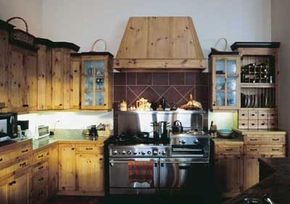
The kitchen feels less like a showroom and more like a place to live. It helps that the cabinetry leans into a Shaker-style aesthetic using knotty pine. Dark molding frames the doors, adding weight to the design. It is a spacious house. Barn-like proportions give it an airy feel, but the wood elements ground it. You have a wood ceiling above. Wood floors below. The pine doors are simple. Black wrought-iron pulls and knobs keep things from getting too sweet. It is updated traditional country charm. Not overly cute. Just solid.
Hiding the Tech Behind the Wood
The stove commands attention. It is a gleaming commercial-style unit. A backsplash of earthy-hued, oversize tiles highlights it. Glass-front cabinets add some visual interest nearby. But the other appliances? They disappear. The refrigerator is tucked behind matching panels. It blends in. You do not see the stainless steel. It keeps the focus on the wood and the cooking space.
The Island with a Secret
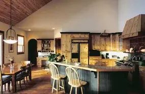
Pull up a stool. The island is well-planned. It elbows around the work zone without blocking traffic. You can move through either end. No bottlenecks. The counter front is wainscoted. It is painted green. This matches the cabinet trim. It breaks the monotony.
There is a hidden feature here. The main counter is raised. Behind it, a lower counter hides a sink. Dirty dishes can end up there. They are out of sight. It is a practical solution for a busy kitchen. The design works because it anticipates the mess. You cook. You clean. The space handles it.

Look at that light. It’s not just bright; it’s heavy. Santa Fe kitchens don’t hide in shadows. They lean into the sun. The walls aren’t white. They are stained, plastered, or painted in earth tones that mimic the surrounding landscape. Red clay. Blue sky. Green chile.
If you want this vibe in your own kitchen, you don’t need a remodel. You need intention.
Start with the floor. Tile is king. Specifically, ceramic or terracotta. It holds heat. It feels cool under bare feet in the summer and warms up by the time you’re making dinner. If you can’t tear up your hardwood, lay down a jute rug. Natural fibers. Rough texture. It grounds the space.
Then, look at the wood. Cabinets shouldn’t be glossy. They should be matte. Dark walnut or cedar. Or, if you’re on a budget, stain pine and distress it. Scratches are features, not flaws, in this style. They tell a story of meals cooked over open flames or wood stoves.
Metalwork matters. Brass handles. Wrought iron hooks. Even the faucet. Skip the chrome. Chrome feels like a hospital. Brass feels like a home. It patinas over time. It gets better.
And the accents. This is where people get it wrong. They buy knick-knacks. They buy “Southwestern” themed items that look like souvenirs. Don’t do that.
Buy pottery. Real pottery. Hand-thrown. Glazed in muted tones. Use it, too. Don’t put it on a shelf. Set the table with it. Let the rough edges catch the light.
Add textiles. Woven blankets. Ombre pillows. Cotton throws with geometric patterns. Not Aztec prints slathered across everything. Just touches. A runner on the island. A cushion on the chair.
Lighting is non-negotiable. No recessed cans if you can help it. You want warm, low-hanging fixtures. Pendant lights with hammered copper shades. Or simple paper lanterns. Soft light. Shadowy corners.
Why does this work? Because it mimics the environment. It’s not about copying a culture. It’s about responding to a climate. Hot days. Cold nights. Dry air. The materials breathe. They adjust.
So, step one. Pick a color. Not black. Not white. Pick a color that exists in your backyard. Sand. Sage. Rust. Pick one.
Step two. Change one fixture. The knob. The lamp. The rug.
Step three. Buy a bowl. Fill it with fruit. Or stones. Don’t overthink it.
The goal isn’t perfection. It’s presence. Can you stand in the kitchen and feel the sun on your face? Can you hear the wind outside? If not, you’re close. But not there yet.
There’s more to explore if you want to push the aesthetic further. Or pull it back. But start with the basics. Earth. Light. Texture.
The best Southwestern kitchens don’t try to be decorative. They try to be lived-in.
If you’re stuck on specific rooms, the logic holds. Dining rooms need heavy wood tables. Bedrooms need soft linens and low beds. Bathrooms need stone sinks and copper taps. Home offices? Maybe a leather chair
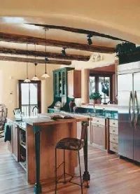

How Arts and Crafts Design Meets Southwestern Style in a Santa Fe Kitchen
You walk into this Santa Fe kitchen and the first thing that hits you is the texture. Rough-hewn timber beams cross the ceiling. Plaster walls catch the light. It feels like the Southwest. But look closer. There is an Arts and Crafts influence here that changes the whole vibe. This isn’t just rustic. It is crafted.
The room doesn’t shout. It doesn’t need to. By keeping the decoration minimal, the design lets the actual workmanship stand out. The materials speak for themselves.
At the center of it all is the island. It isn’t just a slab of stone. It serves two distinct purposes. It provides prep space for the cook. It offers a sitting spot for the family. The two-level design makes this possible.
Consider the placement of the microwave. It sits at a lower height. This is a practical detail for kids. They can make their own snacks without reaching up high. It encourages independence while you cook.
The granite countertop adds durability. The auxiliary sink adds convenience. Together, they handle the daily grind of meal prep. You aren’t fighting for counter space. You aren’t waiting for the main sink to clear.
But the real twist in this kitchen design comes from the legs. They are slender. They look like furniture. Specifically, they look like a sideboard or a buffet table. This elevates the island from a utility piece to a design feature.
The legs are painted a deep, rich green. It’s a bold choice. It matches the tall hutch standing guard by the door. That green ties the room together. It provides a visual anchor.
Without that hutch, the space might feel too cold. The granite is hard-edged. The stainless steel appliances are modern. They clash with the rustic wood. The hutch introduces warmth. It breaks up the industrial feel.
Then there is the floor. It is natural red birch. This wood acts as a peacemaker. It bridges the gap between the modern fixtures and the old-world beams. It pulls the factors together congenially.
The result is a kitchen that feels casual. It is comfortable. It doesn’t try too hard. It just works.
Elements That Make a Casual Kitchen Work
You want a kitchen that feels lived-in but not cluttered. You want style that doesn’t sacrifice function. Here is how you can replicate this balance.
Start with the island. Don’t just buy a standard unit. Look for one with character. Slender legs or a furniture-style base can change the entire room. It softens the lines. It makes the space feel more inviting.
Choose your colors wisely. A deep green can ground a room. It pairs well with natural wood tones and stone surfaces. If your cabinets are too busy, lean on accessories to add color.
Think about placement. Where does the microwave go? If you have kids, lower it. If you have arthritis, raise it. Design for the people who will actually use the space.
Mix materials. Don’t be afraid to combine granite with wood. Combine stainless steel with plaster. The contrast creates interest. The key is balance. Use a neutral element, like your flooring, to tie disparate styles together.
Red birch floors work well here. They are durable. They have warmth. They don’t reflect light as harsh

The Illusion of Minimalism
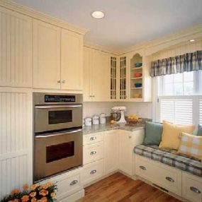
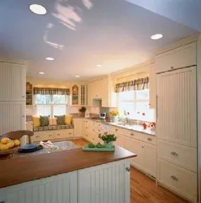
It feels like a kitchen built for living. Not just cooking. The design leans hard into traditional cabinetry, which acts as a visual anchor. You might think this is a minimalist project. It isn’t. The vibe is more cookie-jar cheerful than sterile white. A few strategic splashes of color do the heavy lifting. They keep the mood bright without cluttering the sightlines.
Panel-Ready Appliances
The secret to the clean look? Hiding the tech. Most appliances are buried behind custom matching panels. This creates a unified front. It stops the eye from snagging on stainless steel or black glass. The space reads as cabinetry first. Appliance second. This approach requires precision during installation. The panels must align perfectly with the woodwork. One misaligned screw hole ruins the illusion.
Nooks for Nurturing
But don’t let the clean lines fool you. This room is designed for messy, happy living. Open shelves break up the wall of cabinets. They hold vibrant pottery. The colors pop against the neutral wood. It’s a place for nurturing. Look at the window seat. It’s not just storage. It’s a perch. A comfy spot to watch rain or eat breakfast.
There’s also a mini-breakfast bar tucked into a nook. Small details like this matter. You can grab a snack without crossing the entire room. The fabrics on the seat and shelves add texture. They soften the hard edges of the wood and stone. It’s functional warmth.
Materials and Execution
If you’re tackling this yourself, start with the cabinetry. Traditional styles often feature raised panel doors. They hide fingerprints better than flat slab doors. Paint or stain consistently. The panels on your fridge and dishwasher must match the wood tone exactly.
For the open shelving, use sturdy brackets. Ceramic pottery is heavy. Wall anchors are non-negotiable. Mix in textiles. A woven basket or a linen runner adds softness. It keeps the space from feeling too rigid.
Safety check. Ensure the window seat is securely anchored to the wall. Kids climb. Adults lean. Structural integrity matters more than aesthetics here. The mini-bar needs adequate clearance. Don’t let it crowd the main walkway. Measure twice. Cut once.

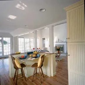
The transition between a grand great room and the kitchen needs to feel intentional, not accidental. You might have a fireplace anchoring the social space, drawing people in with its warmth and elegance. Then you step into the kitchen. It should feel different. Less curated. More lived-in.
Wood flooring often bridges the gap. It provides continuity. It tells the eye that these are one home. But the vibe shifts. The great room is for cocktails. For sipping wine by the hearth. The kitchen is for hot chocolate. For marshmallows. For messy afternoons.
Balancing Aesthetics and Utility
When planning this layout, you are managing two distinct personalities. The great room speaks of entertaining. The kitchen speaks of doing.
If you are renovating, consider how you want the space to function. A formal great room often demands pristine surfaces. A working kitchen requires durability. You can share materials like wide-plank hardwood to unify the look. But the texture and finish should differ.
Practical Choices for the Working Zone
The kitchen needs to handle heat, spills, and foot traffic. The great room handles conversation. Here is how to make that work practically.
- Flooring : Use the same wood species for visual flow. But choose a harder finish or a matte sealant for the kitchen side. It hides scratches and scuffs better than a high-gloss polish.
- Lighting : The great room might have dimmable sconces or a chandelier. The kitchen needs task lighting. Under-cabinet LEDs are essential. They cut through the shadows where you actually chop and stir.
- Materials : Stone countertops in the great room might be marble. In the kitchen, switch to quartz or granite. Marble etches. It stains. You do not want lemon juice on it while you are making breakfast.
Defining the Zones Without Walls
You do not need a door to separate these spaces. A change in ceiling height can help. A drop ceiling in the kitchen can define the zone. It also hides ductwork for better ventilation.
Furniture placement matters too. Place a large island in the kitchen. It acts as a barrier. It anchors the space. It gives you a place to stand while the rest of the house feels more open.
The Safety Factor
A fireplace nearby changes the safety equation. Heat rises. Smoke travels. Ensure your kitchen ventilation is robust. A strong range hood is non-negotiable. It pulls steam and grease away before it settles on your wood floors or drifts toward the fireplace seating area.
Also, keep flammable items away from the hearth. The great room is cozy. The kitchen is busy. You do not want a stray towel from the drying rack drifting into the fire zone.
Why This Contrast Works
People crave contrast. A house that is all one thing feels flat. The elegance of the great room makes the kitchen feel more approachable. The utility of the kitchen makes the great room feel more luxurious by comparison.
You get the best of both worlds. You can host a dinner party in the great room while the chef works in the kitchen. Or you can retreat to the kitchen for a quiet moment after the guests leave.
Materials to Consider
| Feature | Great Room | Kitchen |
|---|---|---|
The kitchen doesn’t have to be a clutter of open shelves and mismatched ceramics. You can achieve a streamlined look that feels less like a showroom and more like a place where you actually cook. The clean and neat kitchen design leans heavily on minimalism. It strips away the visual noise.
Why Streamlined Kitchens Work
A clutter-free space reduces mental fatigue. When your countertops are clear, meal prep becomes faster. You aren’t hunting for a spatula buried under mail or magnets. The streamlined aesthetic is about function first. Form follows function in these spaces.
Key Elements of the Clean Look
To get this style, you need to be ruthless about what stays and what goes.
- Hidden Storage: Drawers with dividers are non-negotiable. Every utensil needs a home. If it doesn’t have a place, it doesn’t stay.
- Closed Cabinets: Upper cabinets should be mostly closed. Glass fronts work if they contain matching sets. Otherwise, stick to solid doors.
- Uniform Appliances: Stainless steel is fine, but mixing finishes creates visual chaos. Pick one tone. Match your fridge and dishwasher.
- Lighting: Under-cabinet LED strips replace bulky fixtures. They illuminate the workspace without adding bulk.
Tools and Materials Needed
You don’t need a full remodel to start.
- Drawer organizers: Plastic or wood, depending on your budget.
- Label maker: Not for decoration, but for efficiency. It keeps jars consistent.
- Cleaning supplies: Microfiber cloths and vinegar solution. A clean surface reflects light better.
- Cabinet liners: Non-adhesive rubber sheets prevent slipping and protect wood.
How to Implement This Design
Start small. Pick one section of your kitchen. Clear everything off the counters. Wipe down the surfaces. Then, put back only what you use daily. Move the rest to drawers or upper shelves.
Consider your workflow. The “work triangle” between sink, stove, and fridge should remain unobstructed. If your dishwasher is far from the sink, you’re working against yourself. Rearranging items can improve flow without costing a dime.
Which Materials Last Longest?
Quartz countertops resist staining better than marble. They don’t need sealing. Laminate is cheaper but can peel at the edges. Hardwood floors are warm but scratch easily. Porcelain tile is durable and easy to clean. Choose based on your lifestyle. If you cook heavily daily, durability wins over aesthetics.
Where to Find Inspiration
For more decorating ideas, check out:
- Decorating Ideas
- Dining Room Decorating Ideas
- Bedroom Decorating Ideas
- Bathroom Decorating Ideas
- Home Office Decorating Ideas
- Decorate Home Spaces Ideas
- Interior Decorating
- Home Decorating Tips
- How to Design a Kitchen
The clean kitchen isn’t about perfection. It’s about control. You decide what stays. You decide what goes. The rest follows.
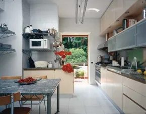

Mixing Industrial Steel with Modern Cabinetry
Forget the rulebook on kitchen storage. This design proves you don’t need uniform cabinetry to create a tidy space. The trick lies in pairing utilitarian steel shelving with sleek, flat-front cabinets.
The steel units handle the heavy lifting for bulkier items. Here, they house the microwave, extra dishes, and those pieces you only pull out once a month. Keeping them off the counters frees up prime real estate.
The cabinets do the daily grind. They keep everyday necessities and food supplies within arm’s reach. This split strategy keeps the kitchen looking clean while remaining highly practical.
You get the open, airy feel of industrial shelves without the clutter. The closed cabinets hide visual noise. It’s a simple swap that makes a massive difference in workflow.
Why This Mix Works for DIYers
You might hesitate to mix materials. Worry less. The contrast creates visual interest without adding complexity. Steel is durable and easy to wipe down. Flat-front cabinets offer a modern, minimalist look that hides messes well.
Consider your storage needs first. Do you use your microwave daily? Then it belongs in a cabinet. If you only use it once a week, steel shelves are better. They keep it visible but out of the way.
The same logic applies to dishes. Store the ones you use every day in lower cabinets. Keep the serving platters and holiday china on open shelves. You’ll save time searching for what you need.
Choosing the Right Shelving
Not all steel shelves are created equal. Look for units with a powder-coated finish. It resists rust and scratches better than bare metal. This is especially important in kitchens where humidity and heat fluctuate.
Measure your space carefully. Industrial shelving often comes in fixed widths. You might need to cut corners or adjust layout slightly. Plan for clearance around appliances. The microwave needs ventilation space. Don’t tuck it into a tight nook.
Install the shelves securely. Use appropriate anchors for your wall type. Drywall alone won’t hold heavy dish stacks. If you’re renting, consider freestanding units that don’t require drilling.
Keeping It Tidy
Open shelving demands discipline. It’s easy for clutter to creep in. Use matching containers for dry goods. They look uniform and save space. Clear bins let you see contents at a glance.
Wipe down steel shelves regularly. Fingerprints show up instantly on polished surfaces. A microfiber cloth works best. For stubborn grease, use a mild degreaser.
Cabinets stay cleaner by default. But don’t neglect them. Line shelves with removable liner. It catches spills and makes cleaning easier. Pull-out organizers can transform deep cabinets into accessible storage.
Balancing Aesthetics and Function
The key is intentionality. Every item should have a place. If it doesn’t fit in a cabinet or on a shelf, it doesn’t belong in the kitchen. Declutter regularly. Donate or discard what you don’t use.
Consider the workflow. Place frequently used items near the prep area. Store cleaning supplies near the sink. Keep trash and recycling easily accessible. These small adjustments save minutes every day.
The combination of steel and wood (or laminate) creates a layered look. It feels lived-in but not messy. It’s a style that ages well. Trends come and go. Function remains constant.
Safety
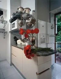

Maximizing Vertical and Surface Space
Stainless-steel storage units offer a practical solution for tight footprints. They install quickly. You get clean lines without the hassle of custom cabinetry.
“Stainless-steel storage units such as these are convenient and easy to install.”
Use the flat tops. Cookbooks and reference guides sit there for immediate access. You aren’t digging through drawers when you need a recipe.
Two people can move through this narrow room without colliding. Counter space exists on both sides. One person chops. The other plates. It works because the workflow is split.
Need more room for jam making or holiday cookie decorating? Move to the table. It is durable enough to handle messy projects. It doubles as a work surface.
Granite counters have their own purpose. They stay cool. That makes them ideal for rolling dough or mixing salads. You get distinct zones for different tasks.
Appliance Selection and Color Strategy
Don’t worry about matching every appliance. Pick items that fit your room’s palette. White. Cream. Gray.
The appliances here vary in color. They might look random. They aren’t. Each unit is placed where it makes sense for the cook. Convenience dictates the layout.
This approach saves money. It also reduces visual clutter. A cohesive look comes from color coordination, not identical finishes.
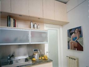

The fridge stays put across from the stainless steel range. The sink is close by too. Grab a plate. Eat at the small table. Or step outside if the weather holds up. Alfresco dining works here.
Stainless steel isn’t just for the stove. It’s in the shelving. It’s on the backsplash. You need to know how to style stainless steel surfaces without them looking cold.
Why Stainless Steel Works in Small Kitchens
It reflects light. That makes tight spaces feel wider. It handles heat and spills. You don’t need to worry about stains.
The look is industrial. It’s clean. It’s practical. But it can feel sterile if you don’t balance it.
How to Add Warmth to Metal Finishes
You need contrast. Wood shelves help. A matte black faucet cuts through the shine. Add green plants. They soften the edges.
“Stainless steel needs texture to breathe. Smooth metal against smooth metal feels like a hospital.”
Consider the backsplash carefully. Tiles add pattern. Metal sheets add reflection. Choose one. Don’t do both unless you’re an expert.
Where to Place Stainless Elements
Keep it strategic. The range goes in the center. Shelves on the walls. A backsplash behind the cook area. Don’t overdo it. Too much metal creates visual noise.
Wood floors ground the space. White cabinets keep it airy. Stainless steel ties it together.
DIY Tips for Metal Accents
Install open shelving yourself. Use steel brackets. Paint them if you want a pop of color. Welded wire baskets add storage. They fit the aesthetic.
Clean it right. Microfiber cloth. White vinegar. No abrasive pads. Scratches ruin the look.
Comparing Stainless to Other Finishes
Brass is warmer. Copper is bold. Stainless is neutral. It fits any color palette.
If you’re on a budget, stick to stainless for appliances. Add metal decor later. It’s cheaper. It’s easier to swap out.
Check the hardware. Knobs and pulls should match. Brushed nickel works. Matte black works. Chrome can clash.
Safety and Maintenance
Steel gets hot. Leave space around the burners. Use oven mitts. Keep flammable items away.
Clean spills immediately. Acidic foods can stain. Lemon juice is fine in moderation. But don’t let it sit.
Inspect the edges. Sharp corners can cut. Sand them down if you’re building shelves. Round the edges for safety.
Next Steps for Your Kitchen
Plan the layout first. Measure everything. Stainless steel doesn’t forgive mistakes. If it doesn’t fit, you’re stuck with it.
Test the lighting. Under-cabinet lights show off the metal. They help with tasks. They add ambiance.
Buy quality materials. Cheap steel dents easily. Thick gauge is better. It lasts longer. It looks better.
Decorate other rooms too. The dining area should match. The living room doesn’t have to. But consistency helps flow.
Explore more ideas online. Look for specific styles. Modern. Industrial. Scandinavian. Each uses metal differently.
Check local suppliers. Prices vary. Some shops offer installation. Others don’t. Decide what you can do yourself.
Safety gear is a must. Gloves. Goggles. A dust mask. Metal cutting creates debris. Protect your
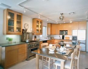

Why This Kitchen Remodel Works Without Breaking the Bank
The original layout wasn’t broken. The bones were solid. It just felt sterile. No character. Just a functional box waiting for some life. The new owners didn’t gut it. They refined it. The result is a light-washed room that feels fresh without trying too hard.
Simple wood cabinets replaced the old ones. Stainless-steel appliances took the place of dated fixtures. The space gained a shipshape tone. It’s clean. It’s orderly. But it’s not cold.
Professional Grade Cooking Meets Social Dining
At the heart of the room sits a professional range. It brings the cooking up to speed. You can actually cook real meals here. Not just reheat leftovers. The cabinetry frames it well. But the real story is in the prep space.
Plenty of stone countertop flanks both sides of the range. This matters when you have people in the room. You need room to move. Room to plate food. Room to breathe. The stone provides ample workspace even when the kitchen is filled with guests. It’s not cramped. It’s functional.
Strategically located track lighting adds to the new appeal. It highlights the counters. It cuts shadows. It makes the stone pop.
“The best dinner parties transpire in the kitchen.”
That’s the goal here. This space was created for a casual lifestyle. Formal dining rooms are for occasions. Kitchens are for living.
The Centerpiece: Stainless-Steel Dining Table
What really sets this remodel apart is the stainless-steel-top dining table. It seats a dozen guests. That’s not a small table. That’s a gathering spot. It anchors the room.
The material choice is practical. Stainless steel is durable. It’s easy to clean. It fits the industrial-modern vibe of the appliances. It doesn’t scratch easily. It doesn’t stain. It just looks good.
Light-toned chairs surround the table. They have comfortable seats. They keep the setting looking open. If you expect a large group, more chairs are easily added. There’s no heavy commitment to fixed seating. It’s flexible.
Practical Takeaways for Your Own Remodel
If you’re looking at your own kitchen and seeing only function, consider what’s missing. Personality. Space. Flow.
- Countertop Space : Don’t skimp on prep area. Stone is a good investment for durability.
- Lighting : Track lighting is versatile. Aim it where you need it.
- Seating : Choose materials that fit the room’s tone. Light colors keep small spaces from feeling tight.
- Appliances : Upgrade the range. It’s the workhorse of the kitchen.
This kitchen isn’t about luxury. It’s about usability. It’s about making a space that people want to hang out in. Even if they’re just making coffee.
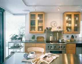

Minimalism isn’t just an aesthetic choice here. It’s a functional strategy. The goal is a clean, modern look that doesn’t feel sterile. You strip away the clutter. You leave room for the architecture of the space to breathe.
Take the wall clock above the range. It’s not just a timekeeper. It’s a deliberate design choice. Its round shape softens the hard lines of the boxy cabinets flanking it. Without that curve, the space might feel too rigid. Too corporate. With it, you get contrast. Visual interest without adding another shelf or knickknack.
Time seems to move differently in this kitchen. Or maybe you’re just not noticing it because the space feels so intentional.
Upscale Dining Atmosphere at Home
Want that same contemporary sharpness but with the warmth of a high-end restaurant? You don’t need to live in Manhattan to get the vibe.
The trick is layering texture and lighting while keeping surfaces clear. Think industrial-chic fixtures. Matte black hardware. Stone countertops that show wear but look expensive. It’s about creating an environment where cooking feels like a performance.
Practical Steps for a Restaurant-Style Kitchen
You can’t just buy the right clock. You need to rethink how you store things.
- Clear Counters: If you can’t see the countertop, you’re doing it wrong. Move the toaster. Hide the blender. Store dry goods in uniform canisters.
- Lighting Layers: Overhead lighting is basic. Add under-cabinet strips for task work. Hang a pendant or two over an island for drama.
- Material Mix: Combine wood (warmth) with metal (edge) and stone (permanence). Don’t stick to one material.
- Strategic Clock Placement: Use walls as canvases. A single large clock or a piece of abstract art beats a gallery wall in a tight space.
Where to Find Inspiration
If you’re serious about this look, you need to look beyond generic home blogs. Look at restaurant design journals. Look at minimalist architecture portfolios.
Here are resources that dig deeper into specific rooms:
- Decorating Ideas – Broad strokes for any room.
- Dining Room Decorating Ideas – Pair your kitchen with a matching dining space.
- Bedroom Decorating Ideas – Extend the minimal theme to your rest area.
- Bathroom Decorating Ideas – Keep the spa-like vibe consistent.
- Home Office Decorating Ideas – Minimalism works well here too.
- Decorate Home Spaces Ideas – Holistic approaches to whole-home flow.
- Interior Decorating – Professional-grade tips.
- Home Decorating Tips – Quick wins for immediate impact.
- How to Design a Kitchen – Step-by-step planning guides.
Why This Works
It works because it removes decision fatigue. When everything has a place and looks similar, you spend less time cleaning and more time living. The restaurant feel comes from that precision. From the knowledge that every item was chosen for a reason.
Is it easy to maintain? Not really. Dust shows on matte black. Water spots appear on stainless steel. But the result is a space that feels curated
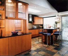

Curved Lines and Dark Surfaces
You want a kitchen that feels like a high-end bistro? Then you are looking at a specific set of design rules. It is not just about cooking. It is about the vibe. Shiny surfaces do the heavy lifting here. Black countertops provide a stark, clean backdrop. They pair perfectly with unadorned wood. That combination is timeless in a modern context. It is simple. It is bold.
But you cannot just buy standard stock cabinets. That will kill the mood immediately. You need to think about geometry. Specifically, how you handle angles.
Ditch the corners. They are cold. They are rigid. Instead, introduce curves. Look at the end of a cabinet run. Make it round. Then, mirror that shape with a structural element. A heavy, round pillar works well. It anchors the space. It breaks up the linearity. Your counter should follow suit. Shape it into a circle. Or an oval. Think of the table at your favorite steakhouse. That roundness invites conversation. It changes how you move through the room.
“Use curves rather than corners, for instance, at the cabinet’s end. Mimic those curves with a weighty round pillar.”
The Seating Compromise
Now, look at the stools. If you are picturing distressed wood with slatted backs, stop. That is country style. This is not a farmhouse kitchen. You cannot bring those rustic vibes into this space. They clash with the sleekness. You need modern-looking seats. Clean lines. Minimalist frames.
But don’t stop at the frame. That is where most people fail. They stop at the metal or the wood. You need to go one step further. The upholstery matters.
Choose plush coverings. Go for bold colors. We are talking purple. Red. Gold. These are rich tones. They pop against the black and wood. They add a layer of luxury. It is about texture and depth. A standard gray cushion will look flat. It will look like an afterthought. Pick a color that feels intentional.
The Narrow Cooking Zone
Finally, look at the walls. Specifically, the area around the stove and ovens. This is a narrow zone. It gets cramped. You do not want clutter. You do not want handles sticking out.
Eliminate the hardware. It is all but gone. This creates a smooth, uninterrupted plane. It is sleek. It is easy to clean. No crumbs getting caught in knobs.
What breaks up the monotony? Stainless steel. Wall ovens. They are shiny. They reflect light. They add a bit of glimmer. But more importantly, they are practical. They save floor space. They keep the cookware off the counter. You get the restaurant aesthetic without sacrificing function. It is a tight balance, but when you get the materials right, it works. The stainless steel shines. The black counters absorb the light. The curves soften the edges.
It is a specific look. It requires precision. You are building a stage for your daily routine. Make sure the props fit the play.
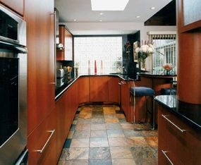

Glass blocks and vertical blinds on the doors create a sleek, European aesthetic that standard curtains simply can’t match. They let in light without sacrificing privacy. The cabinetry here is a peninsula design, mixing high and low units. This layout maximizes storage while keeping counter space accessible. It’s practical for daily cooking but stays visually clean.
The Stone Tile Finish
The real standout is the stone tile flooring. It isn’t uniform. The colors and gradations add texture and depth. This “extra bit of spice” prevents the space from feeling sterile. It grounds the modern lines with something organic.
Glass blocks and vertical blinds offer a sleek alternative to curtains for an elegant look.
Exploring Vintage Updates
You might find your own inspiration in vintage styling. While this kitchen is fully contemporary, the next design example blends old charm with modern updates. It shows how to keep historical character while updating functionality.
More Decorating Resources
For further home decor ideas and tips, check out these categories:
- Decorating Ideas
- Dining Room Decorating Ideas
- Bedroom Decorating Ideas
- Bathroom Decorating Ideas
- Home Office Decorating Ideas
- Decorate Home Spaces Ideas
- Interior Decorating
- Home Decorating Tips
- How to Design a Kitchen
Vintage Kitchen Decorating
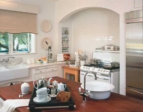

Nostalgia is nice. It’s comforting. But let’s be honest about your actual life. You have schedules to keep. You need a kitchen that can keep up with the pace, not slow you down with high-maintenance surfaces. This design solves that friction.
The white brick tiles aren’t just pretty. They are easy to clean. You can wipe them down without worrying about grout holding onto grease or dirt. That is practical. The skirted island adds another layer of utility. It features a dedicated sink.
The Double-Sink Strategy
You might think one sink is enough. Most people do. But when you are prepping dinner, it changes everything to have a second station. The island sink is small, almost like an antique bowl. It looks delicate. It functions perfectly for rinsing vegetables or mixing salad dressings.
This creates a workflow. You chop at the main counter. You wash in the island. You don’t cross paths with anyone else trying to get a glass of water. It is a subtle shift in how you move through the room. It stops the bottleneck.
Farmhouse Depth and Durability
The color palette stays quiet. Beige and white. It feels simpler. Less cluttered. But do not let the soft colors fool you into thinking this space is fragile.
The deep farmhouse sink is the workhorse here. It is large enough to handle the complex chores. Big pots? No problem. Trays of dirty dishes? They fit. The depth provides leverage. You can scrub without hunching over. Your back stays straight. Your shoulders stay relaxed.
The Range as a Centerpiece
Look at the cooking range. It sits in its own arched alcove. This architectural detail separates the cooking zone from the rest of the room. It gives the appliance presence.
Next to it, a small adjunct table with a butcher-block top offers extra prep space. You can place a cutting board there. Or just set down ingredients while they are not in use. It keeps the main counters clear.
The range itself might look restored. It might look like it belongs in a museum. But the performance is modern. It heats evenly. It responds quickly. The chrome accents on the range match the stainless-steel fridge. This creates a visual link. It ties the room together without you having to try too hard.
Maintenance and Materials
Choosing materials that age well is key. White brick wears better than painted drywall in a high-traffic area. It can take a beating. When it gets dirty, you just wipe it. There is no painting required. No peeling.
Butcher block needs care. You will need to oil it regularly. But that is a small price to pay for the warmth it adds to the space. The contrast between the cool white tiles and the warm wood is intentional. It prevents the room from feeling sterile.
Does a kitchen need to look like a showroom to be functional? No. It just needs to work. This setup proves that you can have style without sacrificing speed. The island sink is the real winner here. It handles the small tasks so the main sink can handle the big ones.
It is a balance. A specific kind of balance. You get the quiet aesthetic you want. But you also get the efficiency you need. The result is a space that
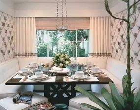
The Social Side of Dining
Forget the chaos of standing in the kitchen. While someone is managing the heat and the pans, your guests have a proper place to gather. The banquette is cozy, comfortable, and built for lingering. The large square table handles a hungry crowd without feeling cramped.
It’s not just about seating. The walls are upholstered, which dampens noise and adds texture. Ribbons crisscross the fabric, holding up a rotating gallery of photos. The display changes constantly. It’s a conversation starter. No two dinners look the same.
Need more chairs? Two square ottomans on wheels roll up to the banquette. They disappear when not needed. The hanging lamp stays simple. It fits a candle perfectly for evening ambiance.
Designing a Functional White Kitchen
How do you balance professional efficiency with home comfort? The goal is a kitchen that feels like a chef’s station but welcomes family. A bright, white palette helps. It reflects light and makes the space feel larger.
Start with the layout. You need clear zones. Prep, cooking, and cleaning should flow without bumping into each other. White cabinets provide a clean backdrop. They hide less than you think, but they look crisp.
Consider the materials. Hardwood floors hold up better than carpet. Quartz countertops resist stains. Stainless steel appliances add a touch of professionalism.
Here are some related ideas to explore:
- Dining Room Decorating Ideas
- Bedroom Decorating Ideas
- Bathroom Decorating Ideas
- Home Office Decorating Ideas
- Decorate Home Spaces Ideas
- Interior Decorating
- Home Decorating Tips
- How to Design a Kitchen
A cheerful white kitchen isn’t just about color. It’s about function. It’s about making sure the space works for you.
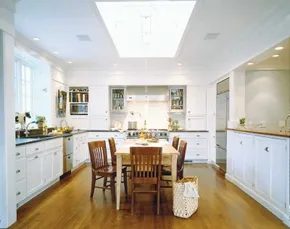
The Social Hub of a Modern Kitchen
Cooking requires light. Not just any lighting, but clear, unshadowed illumination that lets you see every chop and sear. A well-lit kitchen changes how you work. It speeds up prep time. It reduces errors. And it makes the whole process less stressful.
White cabinetry helps here. White reflects light. When you pair that with brick tile, you get texture without clutter. The result is a clean, open feel. It feels efficient. A top chef would approve of this setup.
Then there is the workspace. You need room to breathe. Counters are vital for this. But a large, sturdy table adds versatility. It doubles as a prep station or a dining spot.
Host an intimate dinner? The table handles it. Throw a celebratory feast for friends? It still works. The surface is strong enough to handle heavy pots. It’s flat enough for rolling dough. It’s the heart of the room.
Strategic Sink Placement
Notice the layout. The table sits centrally. To the right, there’s a counter. This isn’t just storage. It’s a serving station. It’s a bar. It’s where drinks go out and plates come in.
And then there’s the second sink.
This is the key to flow. Most kitchens have one main sink. When you’re hosting, that becomes a bottleneck. People line up. Traffic jams happen. You spend more time waiting than cooking.
A second sink solves this. It sits right next to the serving area. Guests can rinse glasses. You can wash veggies. The main sink across the room remains free for heavy-duty cleaning. No one gets in your way. No one waits.
Why This Layout Works
- Zoning: The kitchen isn’t one big blob. It’s broken into zones. Prep, cooking, serving, cleaning. Each has a dedicated spot.
- Traffic Flow: The second sink keeps foot traffic away from the primary cooking zone. You can move freely without colliding with guests.
- Lighting: White surfaces amplify natural light. Brick adds depth. The space doesn’t feel cramped, even when full of people.
“A second sink prevents family and friends from lining up at the main sink.”
This isn’t about luxury. It’s about logistics. You want to cook, not manage a crowd. The design supports that. The white cabinetry keeps the visual noise down. The brick adds warmth. The table brings people together. The sinks keep the workflow smooth.
It’s a balance of function and form. Light fills the room. Hands stay busy. Guests stay happy. The chef stays focused.
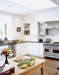

Streamline Your Workflow
Stainless-steel cabinets flank a serious, businesslike range. They are stocked with the chef’s favorite spices and oils. This setup allows for quick grabs. You do not need to move from your command position. A pot spigot sits nearby. It is ideal for filling pasta pots right at the range. This saves steps. Every movement counts.
Storage That Works Hard
Traditional cabinets surround the room on three sides. They feature a variety of storage options. The goal is maximizing efficiency in the cooking zone. Cabinetry is set both above and below the counters. Deep drawers slide out with a slight tug. Inside, you find pots, pans, and lids. Smaller drawers hold cooking utensils.
Timeless Design Choices
The room is grand in size. It remains organized. Simple hardware contributes to this effect. A wood floor adds to the timeless appeal. These are well-thought-out decisions. They keep the space clean.
The kitchen is white with neutral accents. Adding color is a surefire way to spice up the look of any room. See the next page for ideas on adding color to your kitchen.
To get more decorating ideas as well as tips and information on decorating your home, visit:
- Decorating Ideas
- Dining Room Decorating Ideas
- Bedroom Decorating Ideas
- Bathroom Decorating Ideas
- Home Office Decorating Ideas
- Decorate Home Spaces Ideas
- Interior Decorating
- Home Decorating Tips
- How to Design a Kitchen
Single Color Kitchen Decor
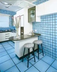

Why Blue Tiles Make Small Kitchens Feel Huge
Most homeowners fear covering both walls and floor in a single bold hue. They worry it will swallow the space. But in a small city kitchen, this dual-tile strategy is the secret weapon.
Pick a deep, Mediterranean blue. Apply it to every vertical and horizontal surface. Then, hit the ceiling with stark white. The contrast is aggressive. It works.
The eye doesn’t get stuck on the boundaries. It floats. The white ceiling acts as a lid, stopping the blue from feeling like a cave. Against that heady background, white cabinets and appliances pop. They snap into focus. You get drama without the clutter.
Breaking Up the Cabinetry
Euro-style cabinets are sleek. They are also prone to looking like a solid block of wood if you aren’t careful. Plain fronts can make the upper units look top-heavy. That’s a visual trap.
Two clear, glass-fronted sections solve this. They break up the sameness. Light passes through. The mass of the cabinetry lightens up. It stops feeling like a barrier and starts feeling like part of the room.
The Island’s Dual Purpose
A small island can feel dainty. Especially with a pristine white base. It shouldn’t. It needs to be a workhorse.
Position it so the cook has easy access. On the cook’s side, install pullout drawers. Use them for table utensils and linens. This keeps the main prep zone clear.
Tools are within reach. No more digging through closed cabinets while dinner is burning. The design is accessible. It is also dainty-looking. That’s a rare combination in urban renovations.
Materials and Safety Notes
When tiling walls and floors, use the same grade of tile. If the floor tile is too smooth, it becomes a slip hazard. Ensure the blue tile has a matte or textured finish if you cook daily.
Glass cabinet fronts require tempered glass. It’s safer if it shatters. Clean them regularly. Water spots on blue-tiled walls become obvious.
Which Approach Fits Your Space?
Is all-over blue the right move? Only if you are ready for high maintenance cleaning. But the payoff is immediate spatial expansion.
Try the white ceiling trick first. It’s cheaper. It’s easier. If you want more impact, add the blue walls. Then the floor.
The island placement matters. Measure twice. The pullout drawers add cost but save time. For a city kitchen, time is the most expensive resource.
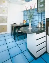

Tucked in a quiet corner, away from the main traffic flow, sits a breakfast nook that actually works. A sturdy table with four chairs fits perfectly there. It’s not an afterthought. The light-collecting glass doors frame the space with blue and yellow accents. These details tie directly into the kitchen’s existing blue color scheme. Meanwhile, the black table and chairs ground the area. They echo the dark grout lines in the tile. It’s a deliberate choice. Nothing looks accidental.
Lighting here is non-negotiable. Cleverly designed soffits direct illumination exactly where it needs to go. No corners left in the dark. No shadows hiding your morning coffee. For the window, a simple white blind keeps the look clean. It doesn’t clutter the sightlines. It just lets light in.
Choosing Your Kitchen Aesthetic
You don’t have to stick to one strict vibe. Whether you lean toward casual, vintage, colorful, wood-heavy, or Southwestern styles, the principles remain the same. The goal is transformation. Use the tips presented here as a starting point. Or ignore them entirely. Mix and match until the room feels like yours.
The kitchen shouldn’t just be functional. It should reflect who you are.
If you’re looking for more ideas, these resources can help you extend that style to the rest of the house:
- Decorating Ideas
- Dining Room Decorating Ideas
- Bedroom Decorating Ideas
- Bathroom Decorating Ideas
- Home Office Decorating Ideas
- Decorate Home Spaces Ideas
- Interior Decorating
- Home Decorating Tips
- How to Design a Kitchen
It’s all about cohesion. Your kitchen connects to the dining area. That connects to the living space. Don’t isolate the room. Let the style flow. You might end up with something unexpected. That’s usually where the best homes come from.


